One product turned into three
Nasdaq’s sustainability product lineup · NDA · Aug 2022 to Jul 2023
- Role
- [Input needed: your role, e.g. Product Designer on the consulting team]
- Client
- Nasdaq
- Duration
- 12 months
- Scope
- Workflows, wireframes, visual and interaction design
NDA note: Content is blurred because of a signed NDA with Nasdaq. Reach out for the password to the full version.
 View full version
01The brief
Nasdaq wants to help the financial industry back a cleaner, more climate-resilient future. Our job was to design the tools for it, and the first step was to understand what Nasdaq already had and where they wanted to go.
We worked through it with the client directly: asking questions, and holding working sessions on how they used their current tools and what they expected next. [Input needed: did you ever speak to the investors who use these tools, or did input come only through Nasdaq’s team? Say which, plainly.]
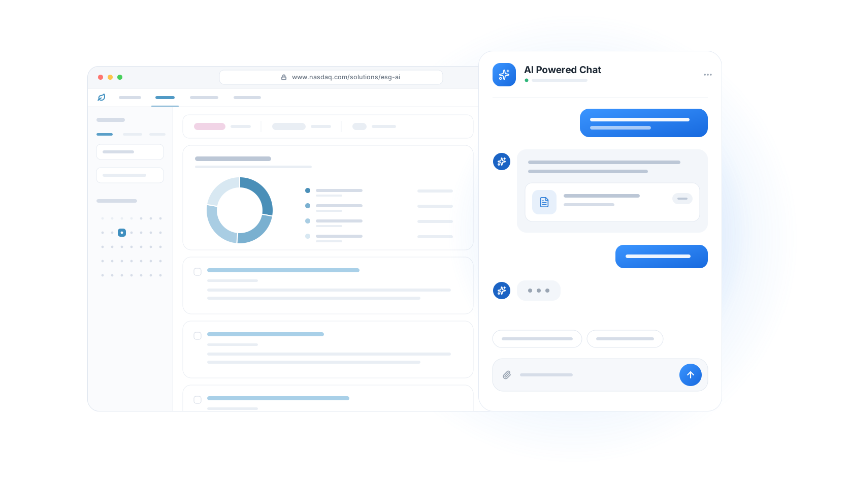
That led to the first product: Sustainable Lens, an ESG research platform powered by AI.
02The lineup
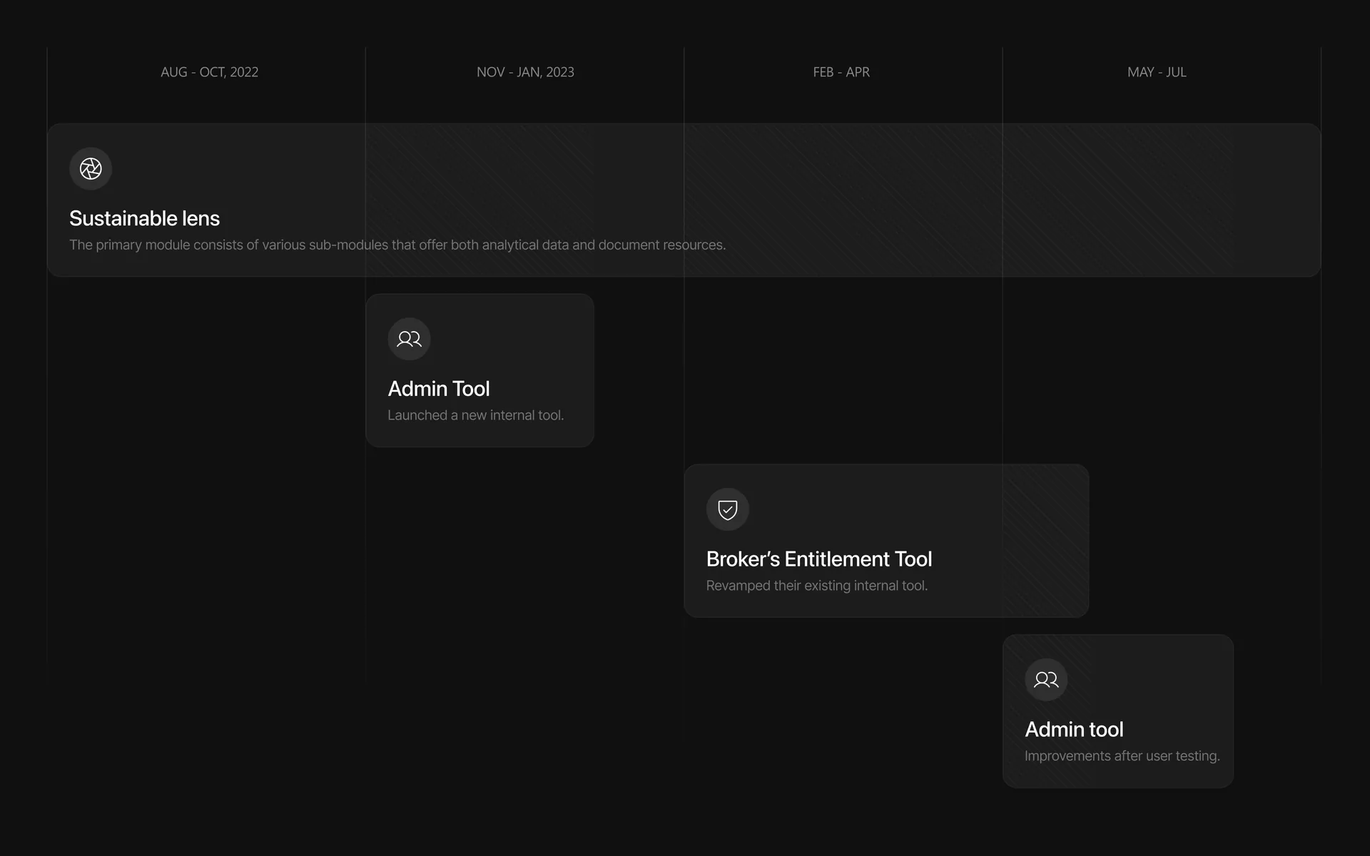
By the end, one project had become three.
- 01Sustainable Lens
The AI-powered ESG research platform, for investors.
- 02Broker entitlement tool
Lets internal teams manage which brokers can access which company reports.
- 03Admin tool
Gives internal teams detailed information on Nasdaq-listed companies, and a way to review them and their documents.
03Sustainable Lens
Which companies are doing right by the climate?
Sustainable Lens helps investors find companies working to be cleaner and fairer, so they can put their money behind them. It reads through company reports, news, and filings, and makes what matters searchable.


Three modules
- Trends
Real-time signals on what companies are talking about. [Input needed: keep “real-time” only if accurate]
- Documents
One place for the climate reports that matter.
- Miscellaneous
Bookmarks, peer lists, and alerts.


04Trends
Spotting shifts early
Trends shows which sustainability topics companies are mentioning more, or less, over time, so investors can spot shifts early.
I started with a flow on paper, then worked through the information architecture and wireframes before any visual design.
The challenge was density. Investors wanted a lot on one screen, and many of them worked on smaller laptops. [Input needed: how did you learn this: the client, investors, or usage data?] So the layout puts the most important data first and keeps everything else one click away.
05Documents
Reading less, finding more
Documents is where research happens. Investors needed climate reports from specific periods, grouped by company, with a quick way into the full report.
Inside a document, I added a reader mode for long reports. It finds guidance items, collects the relevant extracts under each one, and adds an index for jumping between documents.
06The small features
Three smaller features, built for daily research.
- 01Bookmarks
Save documents instead of searching for them again, and share bookmarks with teammates.
- 02Alerts
Set alerts for research, news, filings, and estimates, filtered by peer group and broker.
- 03Peer lists
Create groups of peer companies. Pick a group, and the dashboard shows only that group.
07Two more products
Once Sustainable Lens was delivered, Nasdaq brought us two more. Both were for their internal teams.
- Broker entitlement tool
[Input needed: what you designed or decided on this tool]
- Admin tool
[Input needed: what you designed or decided on this tool]


Nasdaq asking for two more products is the clearest signal I have. [Input needed: any measured results, or what you were told about adoption, and whether these shipped]
08Reflection
What I took from it
- 01Dense products need structure first
Nasdaq’s systems are dense, so I mapped the flow and information architecture before drawing any screen.
- 02Consulting meant leading
I guided the client through the UX process, step by step, which built leadership skills I hadn’t needed before.
- 03Compliance shapes design
Nasdaq works in a heavily regulated space. Learning to build those rules into the UX was one of the biggest lessons.